- Case Study – Tealicious brand identity design
- Client briefing
- Finding the concept
- Brand identity process: 12 steps
- Brand book – What should it include?
- Defining a brand personality
- Packaging
- Client communication & deliverables
- Common mistakes
 Today I’m talking to graphic designer Juana Alvarez about creating brand identities.
Juana has a very interesting background, having worked as a designer for more than 10 years and having traveled quite a lot in the meantime, from her home in Buenos Aires, to New Zealand, Australia, Thailand, Singapore, Spain and finally, Florence, Italy, where she moved four years ago. She says that the “nomad” gene runs in her family, which is why she loves to travel and she always takes her work with her everywhere, even on holidays. She loves her job and thinks that deciding to study graphic design was “the best choice she ever made”.
By day, she works at web design company Lean Panda, by night, she does freelance work for clients from all around the world. One of the projects that caught my attention was the brand identity she did for Tealicious, which I actually printed and pinned it somewhere in my office, because I find it so inspiring. That’s how I decided to do an interview with Juana and learn more about her work process.
F.I.: I love the Tealicious brand identity you designed. What’s the story?
J.A.: Tealicious. That’s a project that I also love. Because I love the person behind it, she’s a good friend of mine and she lives here in Florence. We have two passions: she has a passion for the tea and I for design, and when you mix that you can’t go wrong, it’s impossible! She has her own shop and she does everything by herself, so I offered to do the branding, as my gift to her. Sometimes I do things like this, for free or as part of an exchange, although other designers would kill me for saying that, but I believe in exchange, you know? Not everything’s about money, it’s a great way to move around and do the things you love, but I think it’s important not to go crazy with it. It’s also nice to be able to help others with your work, and in my experience, every time I did something like this, I’ve got rewarded in greater ways!
Tealicious had a different branding before and I used to go to the shop every time and said “Marcela, we need to change this, I cannot look at your logo anymore!!” (laughs). I’m the kind of person that’s always trying to make things better, more beautiful, even if I have to work the extra mile, even if I don’t sleep, but I need to make it better!
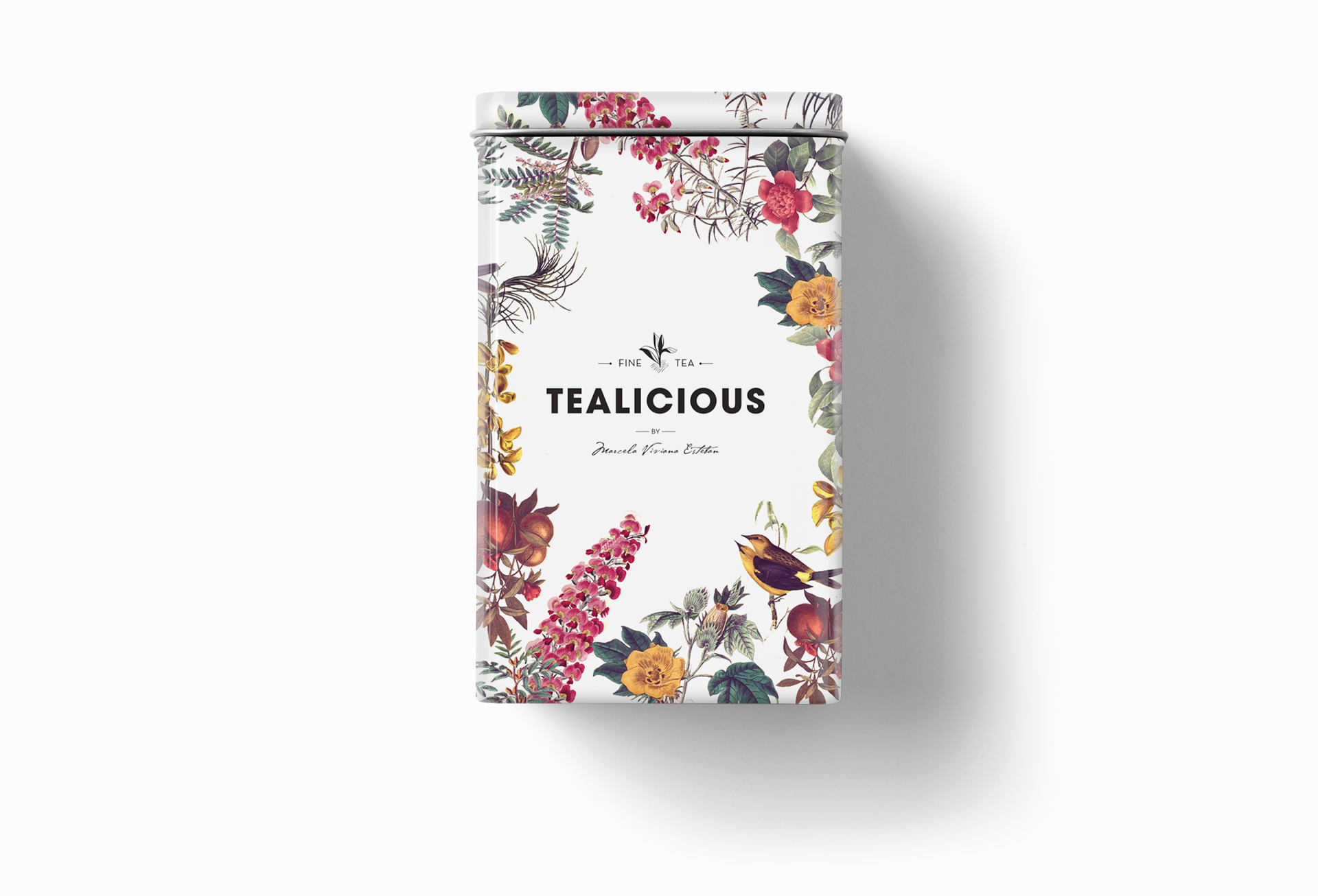
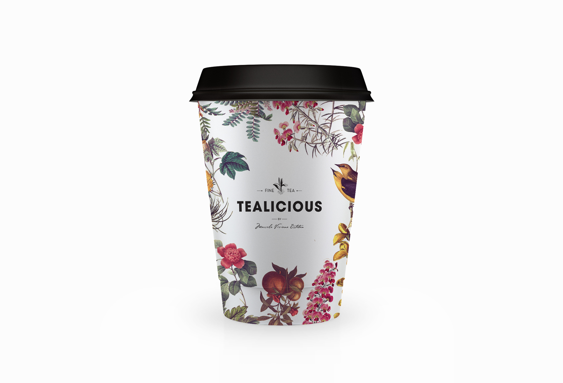
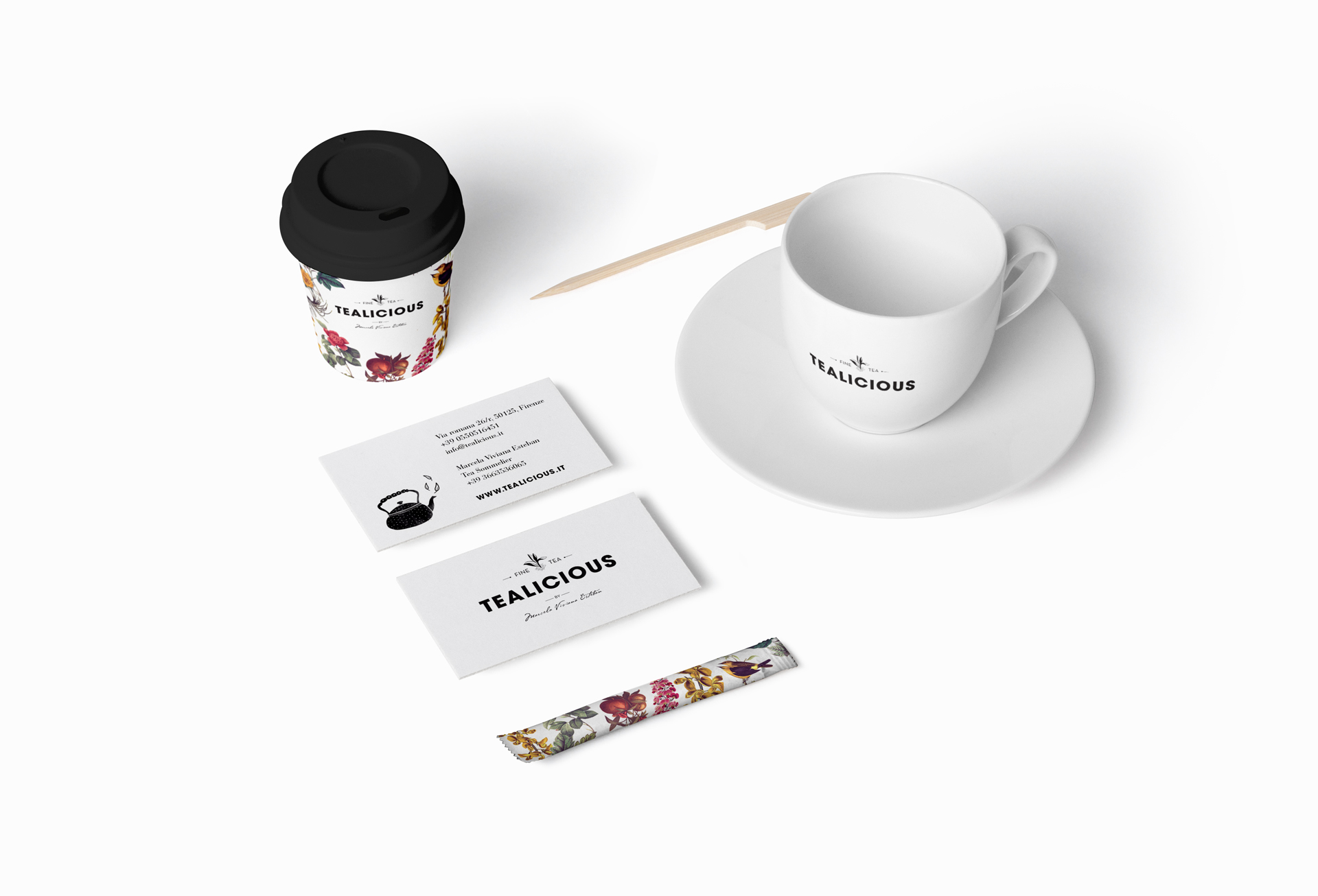
So after a few tries I finally convinced her that we need to change her logo and the packaging. She needed to have a single label that she could use for all her different blends, because she changes her blends all the time. She is a one person company, so she does everything and also she has her own laboratory. Every day she’s inventing new stuff and mixing ingredients. So she needed something that is versatile, where she could write the name of the tea, show the ingredients used in each blend and also specify the temperature and the time of immersion. That’s why we made this label where there are four temperatures and four different times, so she could make a small circle around them. For her that was great, because she just made one print and that’s it.

She needed something that is versatile, where she could write the name of the tea, show the ingredients used in each blend and also specify the temperature and the time of immersion.
I think design should be super functional. Because sometimes we, designers, like to do the best, you know? But then there’s a reality, there’s people who don’t have the money, there’s people who can’t afford to print like seven different labels, and not because of that you don’t have to make something beautiful for them, you know? So I tried to understand what she wanted, to know what she could and couldn’t do, and tried, with these elements, to do my best. And it was great, it was a success and I’m happy because she got a lot of recognition as well, and I enjoyed doing it a lot and now we are even thinking to do a new packaging. Tealicious is growing constantly and has more needs, in the future we may come up with something different!
F.I.: How did the concept for Tealicious begin, where did you start from?
J.A.: Marcela [the client] makes all the blends herself and she has all these little jars, with different leaves and natural flavours. She spends all day doing each blend, grabbing a little bit of this and a little bit of that… she’s like a magician! And her teas really make magic in you, every sip is like a journey to a world of beautiful fragrances.
I did this collage because I wanted things that represent this feeling, like leaves, and nature and all these different fragrances. Because when you enter her little shop and you have all these smells, it’s so wonderful! And I wanted to be able to see the label and enter her universe, something like that, you know? I wanted the packaging to represent all the experience that is, for me, to go to her shop and drink her tea.
F.I.: Before starting a new project, what do you ask the client?
J.A.: Of course, what they do, who they do it for. It’s very important to know who uses their products, who the clients/the customers are. I ask them how they see themselves in the future, if they plan to change, if they’re planning to grow. I ask them a lot of things and I give them a lot of homework (laughs). Because for me, communication is very important. I try to get inside their minds, you know, like a psychologist or something like that. So I ask them all sorts of questions about what they do and I try to understand what they do outside their business, always in a very friendly conversation with them. This way, they get really relaxed, and when you’re relaxed, you’re more open to communication. I try to keep a relaxed atmosphere and sometimes I even end up friends with my clients! (laughs). Well, not super friends, but I have a really good relationship with them. And that’s very important for me, because sometimes, instead of going out and get a drink at night, I sit here and I work. And this energy they give me is my fuel to do nice things and to be happy, you know? Of course, it’s not like I love to work on Saturdays, but if I have to work, I’d better enjoy it, no? Because if you are in a good mood it’s much more likely you’ll end up doing a much better work.
I feel very grateful because I have clients from all around the world, from the States – San Francisco, New York, from Paris, from London, from Singapore, from Australia. And this allows me to keep learning everyday from different cultures, and when you’re working in remote, without knowing each other physically, it’s very important that you create a nice environment, made of trust and understanding.
F.I.: How do you find a concept for a new project?
J.A.: It’s not easy and it’s not always the same, for me. Usually, I try to find inspirations that are similar to what I want to do. Like, I look at a lot of designers, because most of the things have been done already! I think it’s great to get inspiration from other talented designers but also one of the homeworks I ask the client is to make a Pinterest board with the things they love. You know, anything! It doesn’t have to be exactly what they want on their brand, but I ask them to add the things they love, so I get an idea as well of what their tastes are.
I think it’s great to get inspiration from other talented designers but also one of the homeworks I ask the client is to make a Pinterest board with the things they love. You know, anything! It doesn’t have to be exactly what they want on their brand, but I ask them to add the things they love, so I get an idea as well of what their tastes are.
So after I get all the inspiration, I think about it in the shower, while I eat, all the time, I think, think, think! And then suddenly you say” I know what I want to do! I know it, I know it!”. And then you do it and you say “oh no, it wasn’t this!” (laughs). “This is s**t! Let’s try something else, you know?”…
So I do a lot of stuff, and sometimes it takes me a long time, sometimes it takes me nothing. I’m usually pretty fast. In six hours I can do a lot of stuff. This is hard for me, because I charge by hour! (laughs).
F.I.: As long as we’re on that, do you use a tool to keep track of the hours you work?
J.A.: For each client I use a Google doc, where I have all the columns with what I did, how long it took me, how many hours I worked, how much they owe me, how much money they paid me so far. I always get a small advance payment, so when I finish those hours they do another small payment and so on until we finish the project. They have access to the Google doc, so they can track all my hours, so everything is open. It takes them about two weeks to get super comfortable, to know that I do all the work I say I’m going to do, that I’m not cheating with the hours, or things like that.
F.I.: When you start to work on a new branding identity project, what are the steps involved, usually?
J.A.: Step 1. Communication.
You meet the client, ask all kinds of questions, try to get to know them, ask about the brand, the name – does it have any particular significance? Because sometimes, you can relate something to the name, sometimes not, it’s up to us. When was the brand created, how many people work there, what are their goals, what is their target. You ask about the market – if they work in one country, or world wide, if there’s any graphic done so far, any attempts of a logo? Any colors related to the brand, or any preferences?
Step 2. Research.
After having a good idea about the brand, I start looking for inspiration, things that are similar to what I have in mind. It could be photos, color palettes, typefaces, other brands that do something similar, you need to research the competitors as well, you don’t want to end up doing something similar to them, you want to be different. So this is important as well, to see what other brands that work in the same country or in the same city do. So you need to do something better than the competitors – but not only graphically, but functionally as well. I work a lot with web design and it’s important to do functional things, things that work. For example, if you choose a typeface that’s hard to read, that’s not working.
Step 3. Typeface.
When I finally get to work, I usually start with the typeface selection. I first try to define the personality of the brand, as if it was a person. From there you can filter a lot your research, for example you wouldn’t use a serif font if you are talking to a very young crowd. So after I’ve applied this filter I try the name in different fonts, for me this is a very sensitive part, it’s like I let the type talk to me, and try to find a proper type that gets along with the brand universe.
F.I.: You have a library of favorite fonts?
J.A.: I use myfonts.com a lot. I think that’s really cool because there are a lot of options there. Usually, I don’t go crazy with typography, in the sense that I’m very classic, I have fonts that I just love. You can use the same font for different brands, and it’s not like the brand will look the same, because when you mix it with the whole branding, it changes, Maybe you use Futura in two logos, but they look totally different. The sans-serif fonts that I use a lot are Brandon, Futura and Gotham, Helvetica for instance I use every day less and less, and for serif I love Didot or Caslon. I think for all designers there’s typefaces that when you see them you just go, “I love you!”, you know? It’s like love a first sight, haha.
Step 4. Icon.
Sometimes the brand needs an icon to go along. Is not easy to come up with a cool icon, not too obvious and communicative enough. Sometimes literal is good, and depends a lot on the style of the icon. For me is super fun to create them, it’s a very mental game, I can spend hours just trying to find the right concept, and then when you have the idea you spend other lots of hours simplifying it, in order to make it work. There’s so many possibilities to an icon and it’s a great exercise to learn how to use little resources and still be able to communicate an entire brand. And the satisfaction of achieving a good icon is amazing!
First, the icon needs to be simple and needs to communicate the brand identity. Then, you need to try it really small, to see if maybe you need to do an adaptation of the icon. Usually you check to see how it looks in print – in 1 cm, or 3 cm, and if it doesn’t work, maybe you do a small version of the icon. For instance, if you use the icon on a business card, maybe in a small size you cannot read the shapes inside anymore. So you need to make it simpler. But if you’re going to use it in a poster, you need it with detail, so in this case is perfect to use the big icon. That’s why it’s always a good idea to have two options of the icon, and use the one that works better in each scenario.
Step 5. Proportion.
It’s not always easy for me to match the icon with the name, so I’m always trying different positions, and to come up with the right proportion is a challenge!
Sometimes, you have done the icon and you have chosen the type, but when you put them together they may not work! It’s important, when you do the icon, to keep the name close (if you’ve already chosen the type), or maybe you do the icon and then you choose the type, so it can be the other way around. So the proportion is always a challenge! How big is the icon going to be? There are some logos with big icon and small writing, some the other way around. You can put the icon on the right, on the left, on the top, on the bottom, there are so many possibilities and there are not many rules for that, it’s all a matter of taste and proportion, something that you know is right when you see it.
Step 6. Color.
The color is usually the last thing I do. First, I do everything in black and white, making sure that it works like that. I think a logo should work first in black and white, and if I like it like that, then when you apply the color is like an explosion! It takes the design to another level.
Then you have to make sure it works in negative, too. For instance, and this happened to me a lot of times, you do an icon that’s a face (human or animal), and in color it’s all very beautiful, but when you put it in negative, it just doesn’t work. It looks like a demon, you know? (laughs).
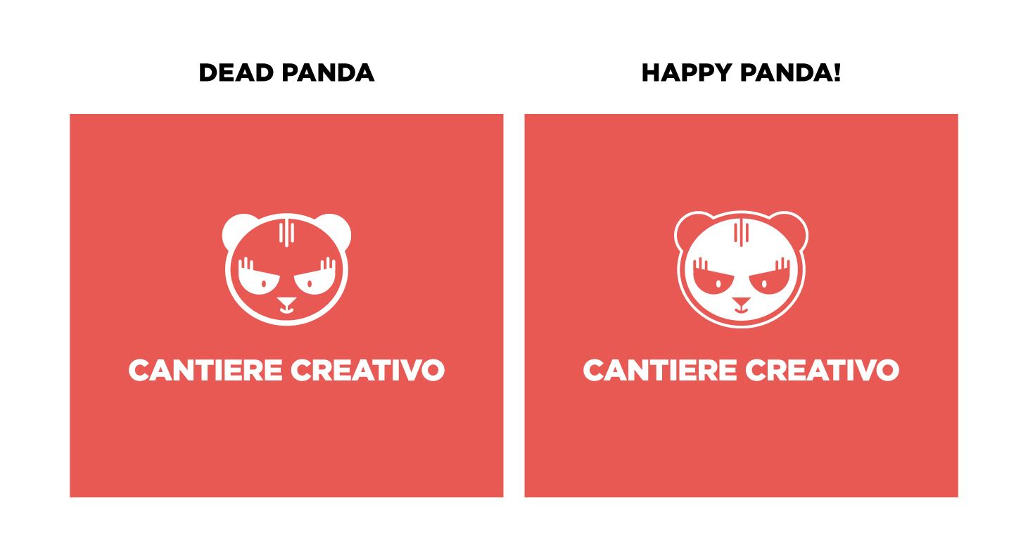
So what you do is, I’m gonna give you an example. The studio where I work – the name is Lean Panda, we have a little panda face, very cute I must say, but when we went in negative (for the business cards), it looked terrible! It looked dead, it looked like he’d been in X Rays, you know? In this case I fix the issue by adding a border around it and then I fill the middle with a plain color, keeping the face the same as it was before.
As for color, you can look for inspiration in things like flowers, photography, you can research color palettes on the street, in the architecture of the buildings, you can search the web, there are a lot of inspiration sources for colors.
Step 7. Pattern.
A lot of times clients come to me and ask me to design patterns along with the logo, so most of the times I do them simultaneously with the brand, I try to see how they work together. It’s important when your are doing a pattern that you choose elements that relate to the brands world, patterns can be a very important ingredient for the look and feel of the brand.
Step 8. Presentation.
 All these steps are repeated several times in the first stage. I usually do at least 3 or 4 propositions of the logo, depends on my inspiration, and then I do a presentation and send it to the client. It’s important to do a nice presentation, don’t do jpegs and send them by themselves in a email. No, that’s not the right way. You need to do a presentation with a cover, like “Hello! This is the cover” then you put, logo 1, logo 2 and so on. Each logo can be followed by an explanation of the concept you use, and if you have time, you can show them the inspirations you use and you can also show the process a little bit, how you came up with the icon.
For example, I’m working on a project that is called Hi Kitchen. So I came up with this idea for the icon, a mix between the word Hi and the word Kitchen. The icon is a dialog icon, and on top, instead of being rounded, I put the cooking hat, you know? So in the presentation I’ve explained where this idea came from, the mix between Hi + Kitchen. So it’s good if you can explain in detail where your concept is coming from, that way you can bring the client on the same path with you. It’s never in vain to explain your ideas, in fact for me it’s a must!
Step 9. Feedback.
I wait very anxious for their response! This is the most adrenaline part of the job. If they don’t like anything, it’s a terrible thing! Usually this doesn’t happen (thank God!). What sometimes does happen is that they choose different elements from each proposal. Like “Oh, I like option 3, but could we have the typeface from option 1 and I love the color from option 2! Could we mix it all together, like a smoothie?” (laughs). And it looks like a Frankenstein!! So then you need to be good enough to mix all the things together nicely and still make something beautiful.
Step 10. More options.
We pass to the second stage, where I do a second round of options, more specific this time, because they may have chosen a font and an icon already, but nevertheless I try to present more options, so they are completely sure about their final choice.
In my experience, I can tell the client almost never likes the very first proposal presented. If you nail it the first time, it means something is wrong.
Because it’s not like you put all your effort to do a perfect logo. You just throw out ideas. What I can say to you, like an advice, is don’t kill yourself 10 hours for each idea. Try to have a few different ones, not very worked out, just to have them choose a path. They have to look beautiful, but not super polished. It’s something you learn in time. You can have 8 ideas and not have to spend a lot of time on them. And it’s good, because the client loves to be able to choose, they just love it.
Step 11. Revisions.
The client reviews it and we keep this logic until we are both happy with the outcome. It’s very important that we are the BOTH happy – this is something I leave clear with all my clients from the beginning. For me it’s very difficult to do something I don’t like. Please don’t ask me. If I say no, try to believe in me.
Step 12. Brand Book.
I then prepare a brand book for them and export the logos in all the formats: PNG, JPG, SVG, in color, B&W, negative, vertical, horizontal, just type, just icon etc. So you need to make little folders with all the options, and you just give them the link (Dropbox, usually) for download, so they have everything.
F.I.: Brand book: What are the usual things a brand book should include?
J.A.: A basic brand book should present the logo in all the different variations (vertical, horizontal, just icon, just type…), logo structure, the dos and don’ts, example: placing the logo in colored backgrounds, which colors are ok and which are not, or if you place the logo over a photo, what treatment this photo should have; how you use the logo on printing materials, on website, on a banner.
The Don’ts are usually about rotating the logo, or not using the logo with this background color, not stretching the logo and all the things they shouldn’t do with it. You need to define the color palette, which is the primary and the secondary (if there is one), the typefaces you are using, patterns if there are any, illustrations if there are any.
Typefaces – usually I choose a font for print and, for web, I go with Google fonts and try to find a matching font.
Imagery – some brands use only illustrations or patterns, others photography, this is very sensitive, because bad photography can ruin your work in a second. It’s important to educate your clients to choose good photography, when used for website the photo should have a good resolution. Sometimes you have to do some extra work in order to create beautiful things. There are some designers that are lazy, there are some designers who are willing to go the extra mile. You have to choose which one you are… better the second one (smiles).
F.I.: How do you make sure the branding is really well thought through? Say they later decide to add new products to the brand, how do you make sure the branding “covers” anything new that comes along?
J.A.: I don’t think you can be really sure about that… can you? I think the brand should be able to last in time, without being old fashioned. What I mean is, you have to be really careful when you choose a typeface or a color theme, sometimes we let ourselves go with the trends, for example nowadays there’s a lot of this “Vintage look” kind of old school… I’m not saying that I don’t like it, but maybe in a few years that will look terrible, so the simpler the brand is the longer it will last, so if you want to go crazy with it, make it with the concept not with the poor font! (laughs)
F.I.: When establishing the concept for the brand’s identity, do you take into consideration things like brand personality and archetype? Or do you just follow your gut?
J.A.: It depends a lot on the type of client, sometimes it’s just necessary to determinate a personality, even to do a character! I have done a few brandings where the logo is actually a guy or an animal. And there’s a lot of times where I just follow my gut, it’s nice when this happens too, because you create the personality while designing.
Sometimes I do a character which is the whole soul of the brand. Like with Green Apes, the logo is this ape, and he became the entire communication, everything goes around him. People love it, they want to see it – it’s like a rockstar (laughs). And in this case, we’ve created the entire personality of this ape. And is like playing God, you decide if the guy is fat, if he’s tall, has small legs, and so on… it’s fun to create this character and all their universe!
F.I.: The first ideas you put “on paper”, do you create them as an individual concept, or within specific materials? Let’s say you start putting together the identity for a tea brand. Do you start by designing the label? Or do you just put together the elements (typeface, illustration, color etc) on a blank piece of paper, and only afterwards you adapt them to the materials (labels, posters, and so on)?
J.A.: If I have to design a brand + packaging I usually do it simultaneously. That’s because I like to see the outcome as a unity, but always giving more independence to the brand, because it has to work by itself, the brand has a whole entire role it has yet to play. As for the packaging it can not live without the logo, so when designing a packaging it’s important to always have the logo as part of the design.
It happened to me that I’ve created a great packaging, but when adding the client’s logo everything seemed very cheap… and sadly you can’t change your clients logo, most of the time.
Another thing when starting a project, always write down what you’ve said in your meetings! For example, this one time the client came to me asking to redesign their scone mix box packaging. I got so carried away that I’ve recreated their box in Photoshop and did all the options, and when I sent them to the client they replied: “Juana, remember we wanted to change our packaging from the box to a stand up pouch?” (laughs) So… I had to readapt all my options for another container and of course the whole design had to change! Packaging changes a lot depending on their container. You wouldn’t believe how much!
F.I.: When you show a client the first options of design, what do you present to them? What elements do you show them and in what form (do you show them product mockups, for instance)?
J.A.: I try to go as real as I can, if I’m designing a packaging I try to do it in the most real way I can. For the logo I usually don’t create mockups, but I’m about to change that, I think is super different to see a logo in white background, then seeing it on a business card for example, or a napkin, or even a wall. Sometimes there’s no budget to do all this personification of the logo, but I think it’s a good idea to do it.
F.I.: Client talk – how do you communicate with the client and how often? Do you meet, do you skype, what is your system?
J.A.: Most of my clients are abroad, so we usually do Skype calls, we exchange a lot of emails in the middle. Usually the first two times are Skype, then we start knowing each other and we don’t need to talk anymore, so we just write emails.
F.I.: Where do you put all the information you deliver to the client? Do you use email, or google files, or dropbox shared folders etc?
J.A.: Dropbox yes, I love it, I only use dropbox, all my files are there. Before it existed I struggle a lot with hard drives, it’s like all your life is in this tiny box that is so sensible, and the stress is too great! I also use Google Drive, for every client I create a excel sheet where I write down every hour I do for them, every payment the do to me, and the final balance.
F.I.: When creating projects for print, do you test the colors beforehand? Do you work with Pantone colors? How do you make sure the colors come out perfect?
J.A.: Pantone I don’t use it very much, usually everything is CMYK lately, it’s a matter of cost I think, but all my clients require the files in that format. I don’t usually work with huge brands, maybe for this kind of customer you are more likely to go for a Pantone, but with middle size companies, they usually print in CMYK.
F.I.: You mentioned that the illustration for Tealicious isn’t your work. Where did you find it? How do you proceed in cases like this, do you buy illustration (or typefaces, also) with licence for commercial use? I am curious about any advice/tips you have.
J.A.: Those are vintage images I find in internet, there’s a lot of sites where you can find images with free rights, for example in Wikimedia Commons. Also I like to buy old naturalistic books and I scan the images inside and use those too. I love creating patterns, it’s such a beautiful experience when you are able to put together these images and create something new, you can spend hours just moving things around, in order to create balance, and then you can play with the colors and the sizes, there’s a lot you can do, but it’s not easy to create something beautiful.
F.I.: Would you like to share any mistakes you made in the past, when designing brand identities, mistakes you learned from? It would be very helpful for me and any other designers wanting to improve, to be able to try and avoid some classic mistakes in this area.
J.A.: Mmm… Always have an extra pair of eyes looking into your designs! My major mistakes are always on the text! Here in Italy they call it the Argentinian style (laughs)! Also when you design in another language that is not the maternal one, it’s more complicated even, so better to have always a double check, yeah? You don’t want to go to print with mistakes.
Don’t hold on to ideals. Just try to listen, to put yourself in the shoes of your client, try not to think of yourself as “God of the graphics”
Always charge in advance!! I had some ugly experience… but luckily I’ve learnt from that and now I divide my work into small stages and ask my client small advance payments until we finish the work, they are more comfortable this way, as well, because most of the times they don’t know me either so is hard to ask them a 50% advance payment just like that!
And don’t hold on to ideals. Just try to listen, to put yourself in the shoes of your client, try not to think of yourself as “God of the graphics”, you know, because that will only harm you. Be more humble (that’s good also in everyday life). Also, try to enjoy your job, always with a smile, always with good energy and people will feel that and work well together.
Always with a smile! That’s my model, smile and never think negatively about your clients or about your projects. I think if you’re doing this job, it’s because you love it. So in order to keep loving it, you need to keep a positive attitude. That’s the most important piece of advice I can give you.
See more of Juana Alvarez’s work on her: website | behance | facebook
About Miruna
Hi, my name is Miruna Sfia. I'm 28 and I'm a self-employed graphic designer and illustrator living in Bucharest, Romania. I created Friday Illustrated because I wanted to be able to learn from some of the best people in my industry.
If you want to know more about the things I work on, feel free to follow me via Facebook, Twitter or Google+