 David Lanham is one of my all-time favorite illustrators and designers, mainly for his awesome style and the fine sense of humor I find in his drawings. So I have to say I have been looking forward to doing this interview for a while, and I’m very excited about it 🙂
Based in Greensboro, North Carolina, US, David Lanham is an illustrator and interface designer with many things going on on his plate. And being the co-founder of awesome software studio Impending and working at the Icon Factory are only a few of them.
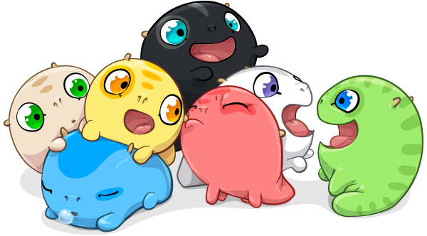
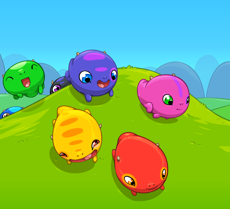
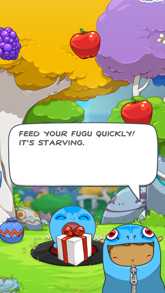
David is the artist behind one of my favorite game apps, Hatch, where he designed the most adorable creatures called “fugus” (here, take a look), and also the designer behind Heads Up! – the game app created for Ellen Degeneres Show.
About his art, he says: “I like to have fun with my drawings and keep them open-ended, inviting you to add your own story”. Well that pretty much sums it up, I say!
Like everyone else, I started drawing when I was kid and just never stopped
Tell me a little bit about you, what is your background, what influences did you have, growing up?
Like everyone else, I started drawing when I was kid and just never stopped. Inspired by family, friends, Saturday cartoons and Sunday comics, there was never a lack of something interesting to try to copy or draw myself.
So it’s partially a ton of practice teaching myself and then some great teachers and professors along the way to really push and refine the interest in drawing and painting to something acceptable. In my home town I was fortunate to have some after school lessons with Jeanne Pelligrino and then at UCF my understanding of line, form, and drawing really took shape with my professor, Robert Rivers.
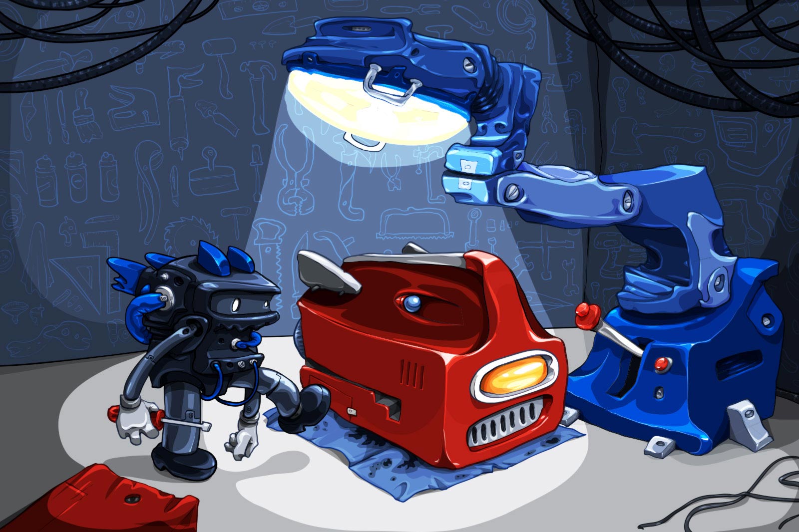
You co-founded Impending, a software studio “responsible” for cool apps like Clear, Hatch and Heads Up! – the iPhone game created for The Ellen Degeneres Show. What is that like, what are your responsibilities there, what is your role?
Basically it’s a ton of fun and I still can’t believe we’re working on such amazing apps 😀 It’s a lot of work and critical thinking and generating ideas, then scrapping it and re-thinking until we get something we love.
My main responsibility is the overall design and experience, but we all take part so much that it blurs the lines and it’s hard to take full credit for any one part. When it comes to the final drawing and visual art, I take care of all that with tweaks and suggestions from the team to refine it.
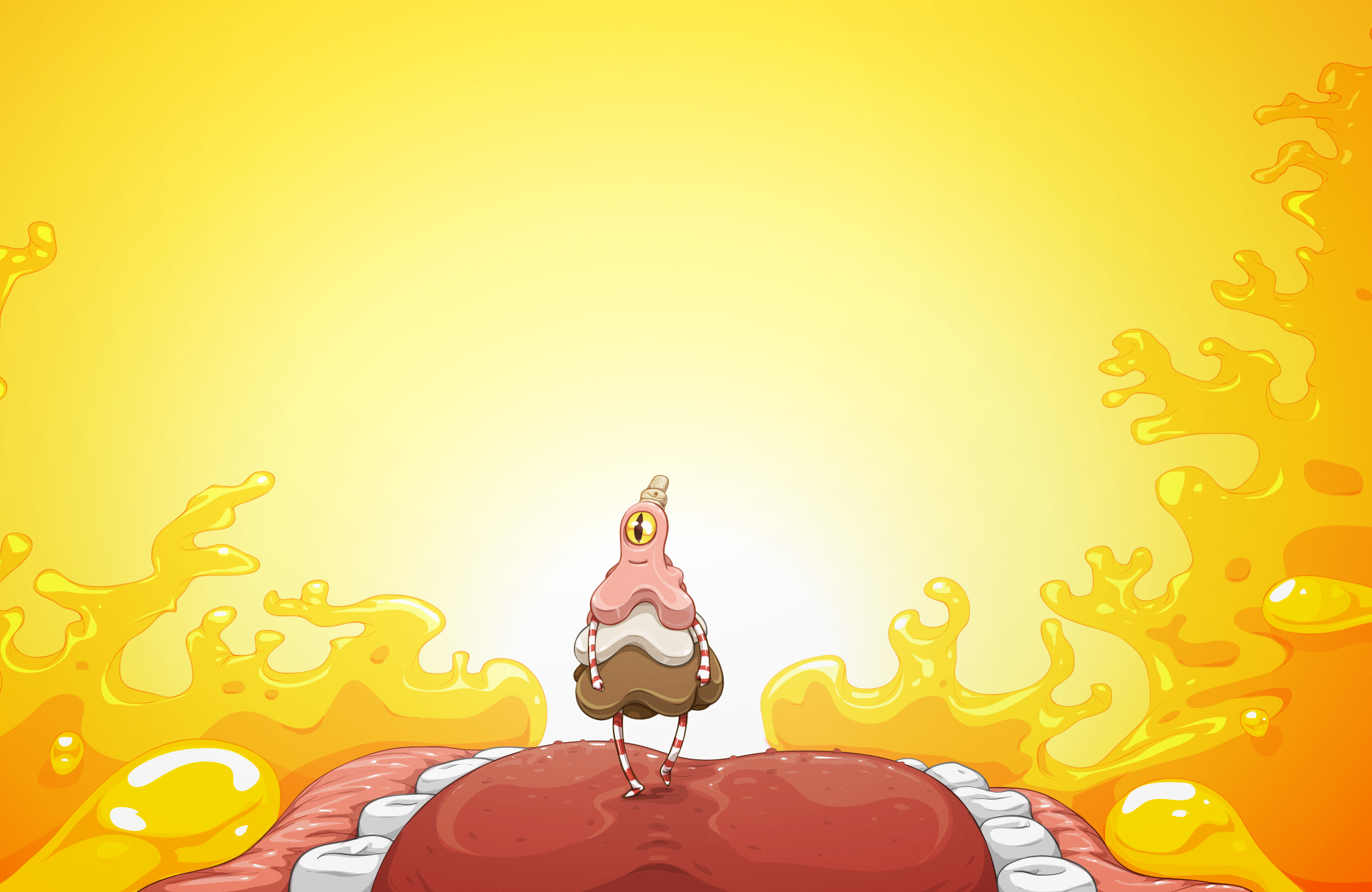
I am a huge fan of Hatch. It’s been about a month since I first downloaded it and I’m still there, playing on a daily basis (I’m not very proud to admit that publicly :D). What was creating Hatch like? I read it took you guys 2 years to come up with the first version?
Thanks! I’ve been playing it for the last two years, so don’t even be embarrassed! Really, the end goal is to have it literally be a pet that loves to see you each day and play a bit, so I’m happy to hear it’s heading in that direction. In hindsight, it was probably crazy to attempt a virtual pet but I’m so glad we took it on. It’s a simple idea but the potential is unlimited so it’s hard to maintain focus with constant brainstorming awesome ideas it could do. Added to that, it’s been my first jump into animation and larger app/game design so we’ve all been learning in huge leaps as we go and a lot ends up getting tossed for better ideas and results. But really, that’s been the fun part and it’s been incredibly satisfying to see our growth and our “baby” come to life 😀
How in the world did you come up with the name of “fugu” for the pet? 😀 (any connection to the Japanese blowfish?)
Mostly we all thought is was a super cute sounding name and fit the pet since it’s puffs up if distressed (try shaking the device). It’s also something that, from a story perspective, Max probably heard somewhere and then used it for this new creature he found in the woods.
We wanted the pet to be cute and endearing but not over the top either
What was the process of design, for you, since you had to create the characters, environments and all the other UI elements?
The process has been a lot of trial and error, exploration, and experimentation with various designs. We wanted the pet to be cute and endearing but not over the top either, so finding a balance there and also making the pet extend further with the color possibilities was a really great challenge.
The environment we always knew we wanted outdoors, but several locations and styles were experimented with until the final was reached.
For the interface, my goal was to have as little as possible and we’ve mostly achieved that so far. Parts like the backpack and store I tried to make more part of the world and environment rather than standard panels so that there’s a level of immersion retained while you’re visiting the Hatch world.
Was everything designed in Illustrator?
It’s a combination of Illustrator and Photoshop. Various parts are easier to design and organize in each, I use a lot of smart objects in Photoshop that contain Illustrator files which I can resize and export easier for interface and objects. Anything animated is easier to export from Illustrator with some special scripts our developer cooked up. All the core drawing is created in Illustrator though, I haven’t found anything else that really gets that clean cel animation look as easily.
Any features or interactions we want to add have to be accompanied by animations to make it work
You previously said it was your first jump into animation. How was that different, for you, compared to your work on other apps? How did that change the way in which you had to think and deliver the character, in order to be ready for animating?
Normally my work in apps is purely with interface and layout, animations play a pretty minimal role and are accessories or small flourishes. With Hatch, the animation is front and center and very large and a full range of emotional states and activities. Any features or interactions we want to add have to be accompanied by animations to make it work. Further complication I brought on myself by wanting to export the fugu characters with multiple layers for randomized spot markings and coloration possibilities. So the animations are created in Illustrator with multiple sub-layers and we have a custom script to export all those as needed once the animation is completed. The exported frames, as png files, are then imported into a sequencing tool and I set up the framerate and other bits there. So that’s all be completely new and much different than previous interface-only animations.
Any future plans involving Hatch?
Oh yea, there’s over a year’s worth of content planned out so we’ll be continually ramping up it’s depth and experience. The first release was really the bare essentials, but we really wanted to get it out there and exposed to help grow it with dedicated pet owners and make sure we keep making it fun and satisfying for everyone.
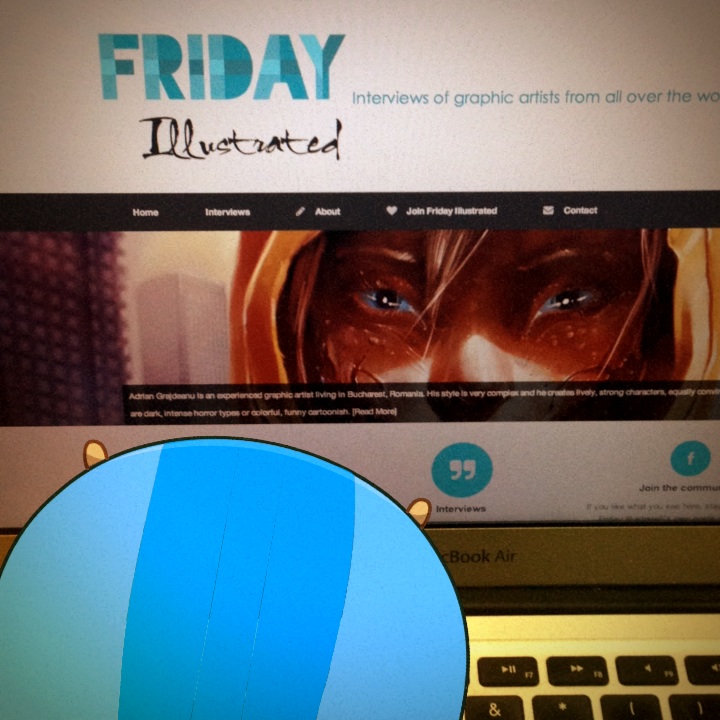
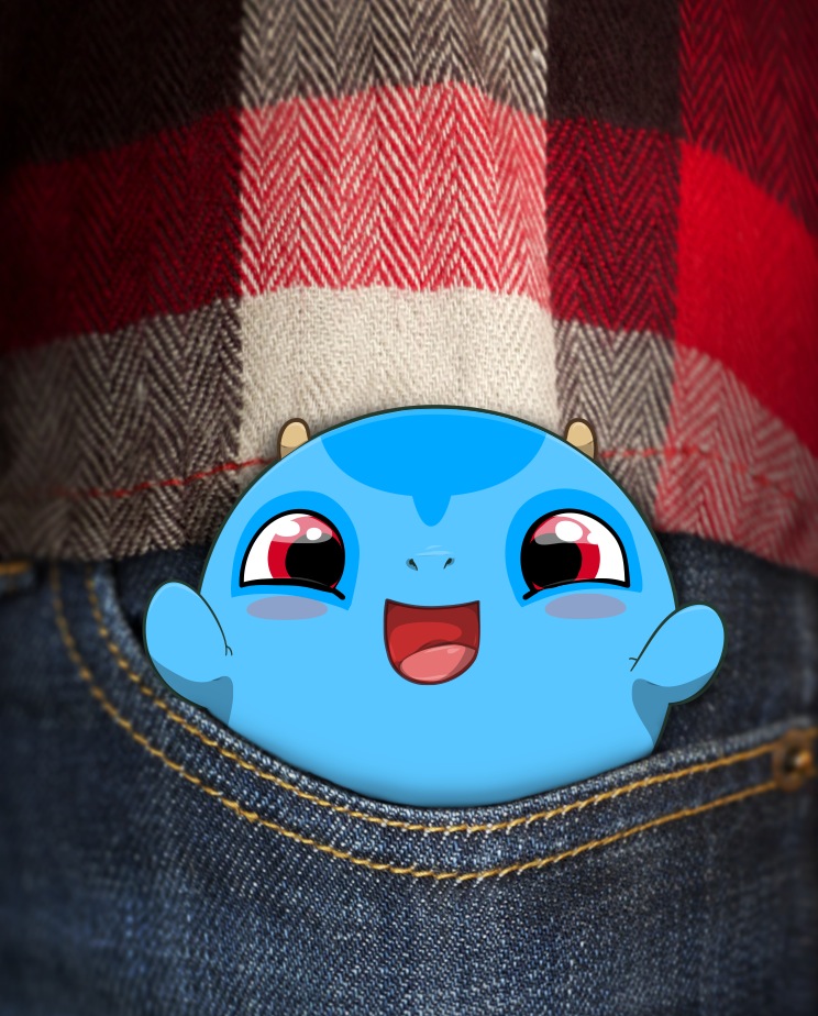
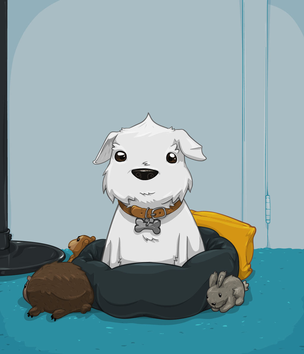
My fugu reading Friday Illustrated 😉 He’s a big fan, btw!
What is the secret to designing such expressive and adorable characters? How do you do it?
It took a lot of research into expressions and faces and just overall experimenting. There’s definitely a fine balance there and its a mix of science and using your intuition to try and give as much personality and emotion as possible. The last few years between Hatch and the social sticker sets have really taught me a lot in those regards.
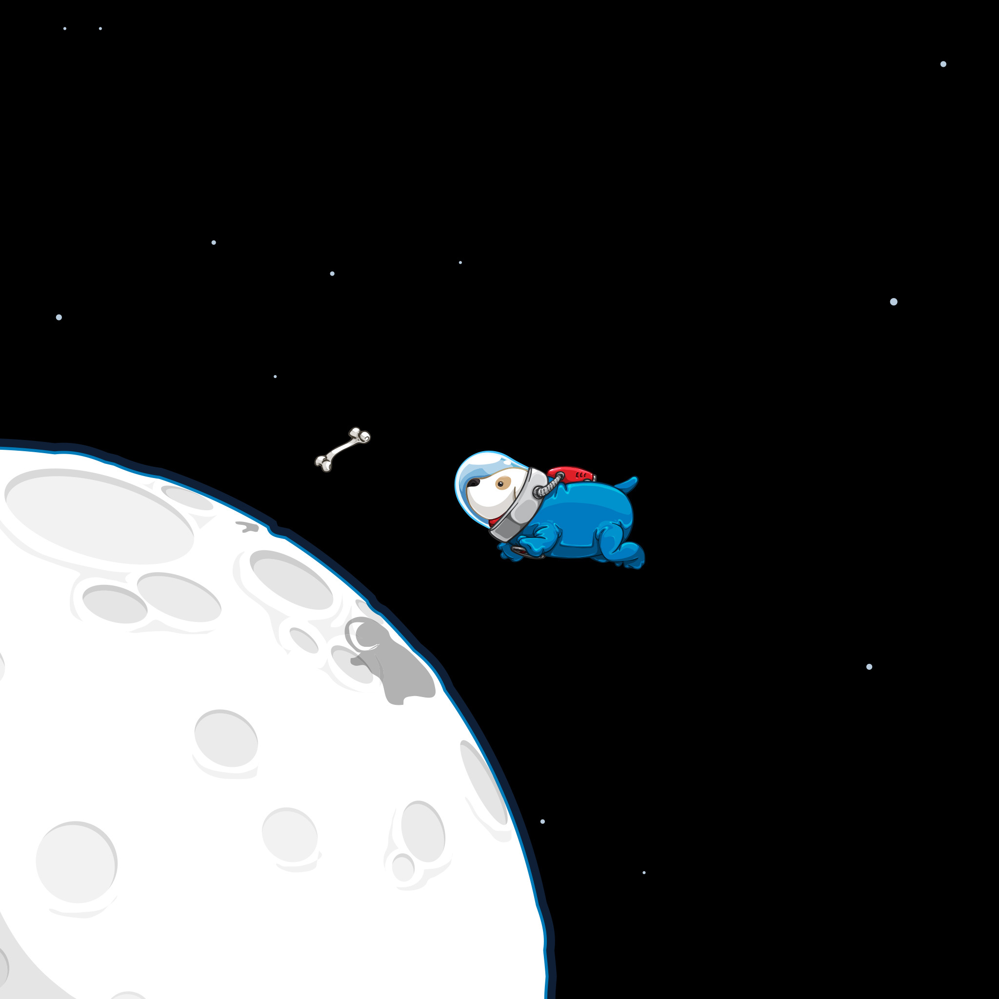
Talking about cute characters… I love your space doggy! It’s funny and a bit sad, at the same time. What is its story? And how did you get to creating it?
I originally drew the space doggy as a part of a freeware icon pack I’m not completely sure where the inspiration was from, maybe just space in general 😛 ). Something about the dog was just really appealing though and I ended up making a wallpaper of him, and of course he needed the bone, why else would a dog be floating around in space? I’ve since redrawn him a couple of times and he’s been quite popular with nearly everyone, one of those happy mysteries of why some things stick and others don’t 🙂
Something about the dog was just really appealing and of course he needed the bone, why else would a dog be floating around in space?
Sometimes I get into comfortable spots with similar colors I like so I have to step back and force myself to try other colors
One thing I particularly love about your designs is how you use color, always with vivid, strong colors, very well mixed together. How did you learn to do that (and what advice would you give someone who wants to learn)?
Pretty much all my color and composition knowledge is from a good foundation of traditional art and paint color mixing combined with learning the fundamentals. I don’t think it’s something you can just pick up and go, it does take some base practice and learning to understand how colors work together. With that base to build on, you can begin to trust your gut and really play and push things to see how far you can take combinations.
Sometimes I get into comfortable spots with similar colors I like so I have to step back and force myself to try other colors I’m not used to starting with, the results are always really interesing to me 😀 I also love seeing how other people combine colors and compositions, I have a lot to learn in overall scene lighting and volume.
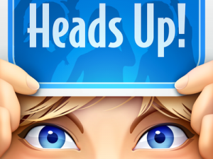
Tell me a little about the Heads Up! app. How did you end up working on an app that got so famous (or, better said, was designed to be famous, from the beginning)? What was that like, for you?
Nothing terribly glamorous but it has been a lot of fun and so satisfying to see so many people enjoying it. It started with a chance meeting where the idea came up, we were pretty excited by it and knocked out a quick prototype which proved to be very fun and playable, then we moved on to our normal process of designing and refining the app to be fun and focused.
You also design icons and user interfaces at the Iconfactory. What is the project you’ve enjoy mostly, working there?
It’d be really hard to pick one project out of all the ones I’ve done, but overall the most satisfying projects have been the recent iOS 7 app and interface design ones. There’s a lot heavier reliance on composition and simplicty while still making sure the icons are obvious and readable (and fun to look at). It has been a blast working through metaphors and doing some critical thinking to solve those icons.
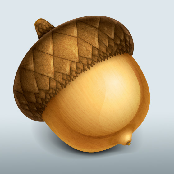

You have designed some awesome icons so far (image: Acorn and Twitterrific). What are the important things to keep in mind, for a well executed icon?
Thanks! The main goal of an icon is to visually represent its purpose as quickly as possible and also be memorable and recognizable for spotting it again. Bonus points for being unique and beautifully rendered, but the main goal definitely towards function over form, but many times an interesting form can come from abstracting the function down to its essential parts.
The main goal of an icon is to visually represent its purpose as quickly as possible and also be memorable and recognizable for spotting it again
Once you mentioned “I try to avoid drawing people in icons as much as possible, but sometimes it really is the best direction ” (source). I’m curious, why do you avoid drawing people in icons?
Mostly people are avoided because they have little to do with the best way to represent a metaphor and unless it’s a very specific context that needs a person in it, adding in a person instantly means you have to deal with gender/race/culture and other physical attributes where it’s difficult or possibly offensive to represent the person in way that’s acceptable to the wide range of people using your app.
The positive effect of character and visual design is becoming much more apparent as the mobile app environment matures. Giving the app a certain look or characteristic can create strong emotional bonds, making the entire app feel personified in a relatable way
Mobile apps are becoming more elaborate and involve more and more illustration, even those that aren’t game-related. Where do you see app design, in a few years, what do you think it’ll evolve into?
The positive effect of character and visual design is becoming much more apparent as the mobile app environment matures. Giving the app a certain look or characteristic can create strong emotional bonds, this isn’t using a mascot, this is making the entire app feel personified in a relatable way, usually towards a more casual character that isn’t all business. Siri is a good example and also apps that word instructions or feedback in a conversational tone, its definitely not just a visual distinction. So I really wouldn’t be surprised to see things head more down this route.
What tools do you use for drawing (software, tablet, laptop)?
I’m pretty minimal with it overall. I have a Retina Macbook Pro hooked up to a Thunderbolt display and I use a bluetooth keyboard/Magic Trackpad and monoprice tablet for working and drawing. I used to use a scanner a good bit, but now I just take photos with my phone when i need to ‘scan’ a pencil drawing. I have some anatomy models and reference books on various subjects and then I have my iPad and iPhone for testing or playing 🙂
For software I’m mostly in Photoshop and Illustrator, although I’ve been enjoying Manga Studio a lot lately for sketching and drawing as well.
I work on something until I get to a point where I need to think on it longer or send it off for feedback and swap to something else, the diversity keeps things interesting
You mentioned being involved in many projects and doing many things at once. How do you manage to avoid from going crazy and keep yourself organized?
I mostly keep organized with a heavy use of notes and reminder lists. I have a project folder for anything active and then I archive once it’s finished up, so there’s nothing strict and usually I have a pretty good idea about what needs to take priority.
So I work on something until I get to a point where I need to think on it longer or send it off for feedback and swap to something else, the diversity keeps things interesting. It could also be that I’ve already gone crazy and it just works for me

Fun illustrations of tea dragons – oolong, chai, grey, darjeeling
Just staying true to yourself and sharing your favorite art in an accessible way and people will take notice over time
You have built a pretty great personal brand, online. What would you advise artists in the beginning of their career to do, to build an image and, more importantly, a community around them?
I’m not entirely sure how it happened, I’m pretty quiet overall and I just started sharing my drawings as free wallpapers and prints and slowly it gained a following. It could be the consistency of the cartoonish style or just the creatures and whimsical drawings that have lots of flat spaces to work well as wallpapers, but word eventually spread or people saw the wallpapers being used by their friends and wanted to get some for themselves as well. I try to help out anyone that comes for advice or contribute to community events and contests, which are also great ways to build a reputation. Nothing seems to happen overnight though, so just staying true to yourself and sharing your favorite art in an accessible way and people will take notice over time.
Creative people who do both designing interfaces and doing illustration are usually inclined more towards one or the other (UI/UX or art). Which do you tend to spend more time on (or find yourself liking more)?
Design and illustration are both really satisfying in their own regards but I’m definitely find myself being drawn to more illustration and character projects/ideas than interface work. I suspect it’s just natural that they would be more appealing overall with their personalities and characters that I get to create there 😀
I read somewhere you visited Pixar and loved it. That sounds exciting, what was that like, for you?
Visiting Pixar was pretty incredible, I’ve never been to one place that put so much emphasis on creativity and fun, but still very business and efficient. Seeing all the preliminary artwork and sketches around was also really insightful and the whole building felt alive and you could tell people working there really love what they do. It has really inspired me to keep pushing myself and skills further to see where it can all be taken.
Practice every day. You can’t really mess up, only learn more about yourself and what you like about how you create, then do more of the parts that make you happy
Any advice for aspiring illustrators?
I’m sure it’s been said a million times, but do what you love and learn the fundamental theory and classical techniques behind your art, then practice every day. You can’t really mess up, only learn more about yourself and what you like about how you create, then do more of the parts that make you happy. It’ll eventually all click together and become increasingly more satisfying.
Follow more of David’s work on his: website (many wallpapers also here) | tumblr | dribble | twitter
About Miruna
Hi, my name is Miruna Sfia. I'm 28 and I'm a self-employed graphic designer and illustrator living in Bucharest, Romania. I created Friday Illustrated because I wanted to be able to learn from some of the best people in my industry.
If you want to know more about the things I work on, feel free to follow me via Facebook, Twitter or Google+