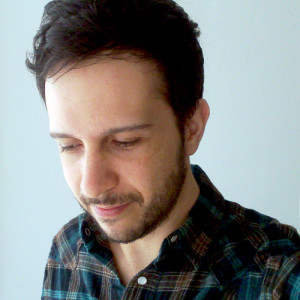
 Cristiano Siqueira (or CrisVector, as he calls himself in social media) is a Brasilian illustrator and graphic designer, specialising in vector art.
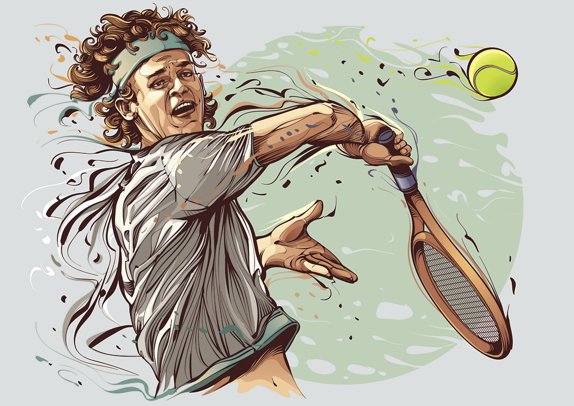
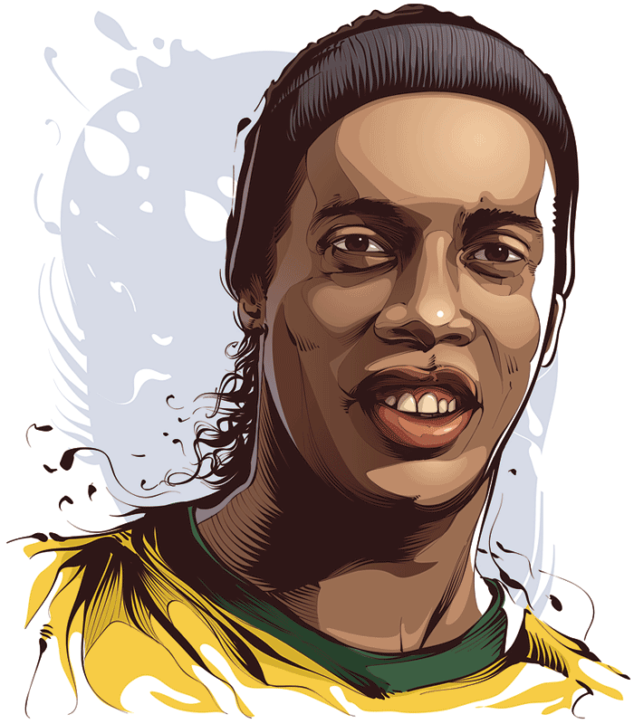
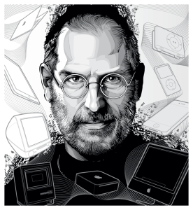
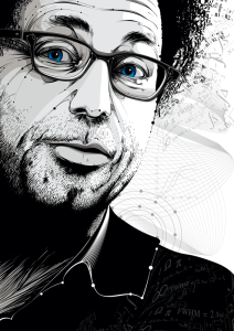
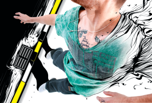
He recently created the awesome illustrated posters of World Cup 2014 for ESPN (if you haven’t seen them yet, take a look!), but this is far from being his greatest achievement. This might have helped him reach a whole new audience and it has certainly grown his fanbase, but before the ESPN project, Cristiano has worked for clients like Nike, Playboy and The Wall Street Journal. He took vector art to a whole new level, mixing painting techniques with dynamic forms, in his own, easy-to-spot style. Read more about Cristiano’s work, opinions on how to work with big clients and self-improvement, in the interview I did with him below:
Before illustration, I did animation and scenography for theatre, adjusted text in pages, cut-off background pictures, redrew logos and such
Tell me a bit about how you started your career. When did it happen and how?
I can say that my career started, actually, in 1999, when I started as an intern in a graphic design studio. Before this time, I had few experiences working with animation and scenography for theater. I got invited by some friends that did the same technical course as I did (Communication Design) and then I started at the studio doing few works like: adjust text in pages, cut-off background pictures, redraw logos and such. At this time I was not into the illustration world, not even studying to be an illustrator. I just got the chance to actually work with illustration years later.

Have you studied graphic design, or are you self taught?
I was studying to become an illustrator or painter. I did a technical course of Communication Design but I never thought to work with graphic design…I wanted to be like a comic artist, painter, illustrator (like Dave McKean, Bill Sienkiewicz, Jonh J. Muth, George Pratt, yeah! I was aiming too high!), so I focused all my studies to learn painting techniques and I didn’t pay attention to the graphic design part (typography, composition, publishing, packaging…) I think I’m half self-taught, half academic. I learned many techniques from professors, but they always encouraged us to try our own way. When you choose a path to find your own style, you need some level of self-taught to keep going ahead. With graphics software I’m totally self-taught.
When you choose a path to find your own style, you need some level of self-taught to keep going ahead
You have 6 years of experience as a graphic designer (according to your website’s about section). Is that a lot, or a little, for a graphic artist? How much have you evolved through the years, what have you learned?
Yeah, I think 6 years is a good time. In 6 years as graphic designer I was able to work in two different studios and work for some different areas of graphic design: Publishing, Advertising, Packaging, Web-Design and, also, had the first contact with professional illustration, doing my first works for clients.
I was deeply involved with graphic design all these years and I was able to learn many things, essentially how to deal with clients from different areas, different audiences and needs, product perceptions, marketing strategies, how to deal with different clients, how to keep organized and protect my work too. In short, the experience with graphic design taught me how to actually work in this field and handed me tools to prepare the field to be an illustrator, later.
In the early 2000’s you could produce a super illustration digitally, which in print reproduction would represent like 60% of the quality of your work
Why vector art?
Well, it was a natural choice. As I said above, I drove all my studies intending to be a painter, so I learned many traditional techniques of painting (acrylics, oil, watercolor..). But, when I started with graphic design, I realized the use of the illustration in this area was really focused on the product and the technical resources to reproduce a work of art in a graphic design piece had some limitations, specially with colors (CMYK standards).
I mean, in the early 2000’s you could produce a super illustration in any techinque, a painting or something like this, very beautiful in the original, but to be in the graphic design piece you should scan the piece and try to retouch the colors in photoshop to be nearly to the original and accept that the reproduction would represent like 60% of the quality of your work. So, I started to think if I could produce an illustration originally in some digital technique and get better results in the reproductions.
At that time, I was using the Macromedia Freehand everyday, doing logotypes redraws for a book (sponsors logotypes that we had only a printed version, to be in the book I had to scan these logotypes and redraw them in vector), when I realized I was actually illustrating logotypes and I was very fast and good doing this. After work, in some spare time, I started to use the same techinques to draw some cartoons as a test, and I saw that I could produce some illustrations without being worried about panting materials (paper, pencil, inks) and eliminating the steps of scan and retouch from the process. So I was producing illustrations in a cheaper and faster way. Then I decided to invest more in developing my technique in vector art and improve my work to reach the quality I had with the paintings.
What tools do you use in your work?
Nowadays I use a Wacom tablet Intuos 4, an iMac, Adobe Photoshop and Adobe Illustrator.
What is your typical process for a piece? Do you sketch, draw, color, and then do the vector art, how does it happen?
I open a file in Photoshop and I do some digital sketches using the Wacom Tablet. Once I get a good sketch for poses and composition, I add more details, still in Photoshop. With a more detailed linework, I add some basic colors and then I send for approval. Once approved, I get this sketch and go to Illustrator to finish the job, drawing again the linework and adding the final colors/shading/backgrounds.

Nike found me on Behance. I got an email from one their art directors asking if I wanted to make some illustrations for basketball t-shirts, of course I said yes and the story started
You have worked with a lot of big clients like Nike, Playboy, Wall Street Journal. How did you end up collaborating with them?
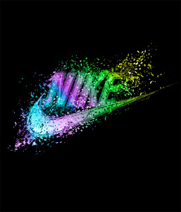
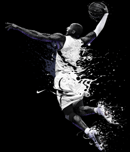
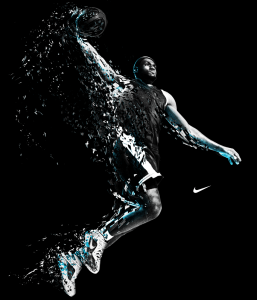
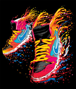
With Nike, they found me ot Behance. I got an email from one their art directors asking if I wanted to make some illustrations for basketball t-shirts, of course I said yes and the story started 🙂 With Playboy (Brazil), I had some conversations with designers of Editora Abril (that produces the Playboy Magazine Brazil) from older works. So, I get invited by the Playboy editor, who already knew my work, to create some illustrations for their anniversary edition, and then I worked with them. The Wall Street Journal was result of the hard work of my agent, Erika Groeschel. She brought this golden opportunity to me and it was very appreciated!
What is the process, when working on a magazine editorial, for example? What steps are involved, from when you pitch to the client, until the final piece? How do you deliver the work?
The process is simple, made of a few steps. Usually the client sends me an email verifying my availability for the job, introducing some brief about the illustration to be done. So I (or Erika) answer with the confirmation and the price (or requesting more details to make the pricing). Once me and the client have a deal about pricing, briefing and deadlines, I start sketching and, after some days, I send the first sketch.
My sketches are a bit more detailed than the usual sketches, I try to show to the client how the work will look at the final, just with less details and precision. Once I get an approval for the sketch, I go to the Illustrator and I finish the job, including all the details, backgrounds, shading… I send the work following the client request. Usually it’s a hi resolution file, bitmap, at the dimensions they need for application. In very special cases, I send the vector file too.
The key is to understand what the client needs and try to fit your work on it, show yourself as a partner
What is the most difficult (or challenging) thing to handle, in your position, when working with big brands?
Being able to make everybody happy. Usually there’s many people involved in the approval of the illustrations (specially big projects) and there’s a high level of exigency. Each person has his own vision and sometimes they wish to see this vision reflected in the work. So, the difficult thing is that I have to think much more or doing a work, get more references and arguments to defend my design choices in a coherent way. Before going to public, I first need to make the work loved by the client staff. 🙂
Do you have any pitching tips or rules, for when you really want to work on a certain project and need to convince the client you’re the one they need? 🙂
The only tip is understand what the client needs and try to fit your work on it. This way you can show yourself as a partner, somebody who can help the client with the work and contribute for the project improvement and reach the objectives. The key thing is not just wish some kind of work just to inflate your own ego or get a brand only for your portfolio, the key is be able to help people, get involved and committed in the process.
What would be your advice to other artists, those who perhaps aren’t “quite there yet”?
Just to keep trying, keep improving their own work and keep improving their self knowledge process. This way you can know more about you, what you are up to and where or who you can help and be useful. Where you can be a great contributor and be able to get strong partnerships and be able to create wonderful things!
See more of Cristiano’s work on his: website | behance | facebook | deviantART
Or contact his agent, Erika Groeschel, for work.
Pingback: Nestle steals illustration and uses it on their Facebook page | Friday Illustrated